 MetaStocker
Titles & keywords
How to Choose Color Keywords for a Stock Pattern
Color keywords are useful when they describe what a buyer can actually see, but a pattern can contain many colors at once. The practical question is not “Which colors appear anywhere?” It is “Which colors define the asset, and which are minor accents?” Treating every pixel equally can produce a noisy keyword list, while mentioning only one color can hide useful search language. This guide uses one worked example to show how to make the distinction, write a clear description, and review the final metadata before export. The example is hypothetical and is not a measured result or a real customer submission.
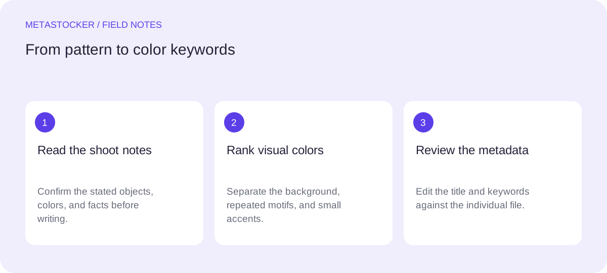
Start with documented facts
Before choosing color terms, separate shoot notes from your own visual reading. For this worked example, the shoot notes state that the asset is a repeating pattern printed with a navy-blue background, mustard-yellow circles, coral-red arcs, and small white dots. The notes identify no people, logos, brands, location, date, or ownership details. Those facts are stated before they are used in the metadata example.
The notes establish the objects and named colors, but they do not decide which colors deserve the strongest positions. That requires looking at the asset and judging visual prominence. Do not add materials, cultural associations, places, subjects, or intended uses unless they are documented or plainly supported by the file.
- Use shoot notes for supplied facts such as identified colors and objects.
- Use the image to judge visual prominence, repetition, and contrast.
- Keep undocumented assumptions out of titles and keywords.
Separate dominant from incidental colors
A dominant color occupies or frames a substantial part of the composition and helps someone recognize the asset quickly. In the example, navy blue is the background, so it is a defining color. Mustard yellow and coral red are repeated pattern elements, so they are meaningful secondary colors. White appears only in small dots; it is visible and relevant, but incidental rather than structural.
This does not mean every background color must outrank every foreground color. Consider area, repetition, contrast, and the role a color plays in the visual concept. A tiny red mark may be irrelevant in one file, while repeated red motifs may be an important part of a pattern series. Make the decision per asset, not once for an entire batch.
- Dominant: navy blue background.
- Secondary: mustard yellow circles and coral red arcs.
- Incidental: small white dots, still relevant when clearly visible.
Build the title around the visual idea
A title should identify the asset naturally, rather than becoming a list of color words. For the example, a useful title is “Seamless geometric pattern with navy, mustard and coral shapes.” It communicates the format, visual structure, and principal colors in a short phrase. The small white dots do not need to appear in the title because they are not central to recognition.
If the target platform has a title limit, check the current contributor guidance before uploading. Adobe’s current guidance favors brief, accurate titles, ideally under 70 characters, and recommends placing important terms early. Shutterstock likewise distinguishes a descriptive phrase from a keyword list. Requirements can change, so the current contributor portal remains the final authority.
- Name the pattern or subject first.
- Include the strongest color terms only when they clarify the image.
- Do not turn the title into comma-separated keyword spam.
Seamless geometric pattern with navy, mustard and coral shapes
Order keywords by importance
For the same example, begin with the asset type and visual structure, then add the dominant and repeated colors, followed by the smaller accent and broader relevant concepts. A possible sequence is: seamless pattern, geometric, repeating, background, navy blue, mustard yellow, coral red, white, circles, arcs, dots, decorative, textile, wallpaper, abstract, modern, colorful, design.
This order makes the color decision visible: navy blue comes before the smaller white accent because the background defines the composition. Do not add color synonyms merely to increase volume. “Navy blue” and “blue” may both be useful in some systems, but review whether each term accurately improves discoverability and whether the platform treats duplicates or near-duplicates differently. Adobe permits up to 49 keywords and emphasizes the first ten; Shutterstock’s stated range is 7 to 50 relevant keywords. Use only relevant terms and verify current rules.
- Put the strongest visual concepts first.
- Use compound color terms when they describe the image precisely.
- Remove colors that occur only as accidental artifacts or cannot be seen clearly.
seamless pattern, geometric, repeating, background, navy blue, mustard yellow, coral red, white, circles, arcs, dots, decorative, textile, wallpaper, abstract, modern, colorful, design
Review an English metadata set
Suppose the contributor account is configured for English. The metadata should remain in English even if the contributor is writing these editorial notes in Russian. For the worked example, compare the title and keywords against the actual file: navy blue is structural, mustard yellow and coral red repeat, and white is a small but intentional accent. The description should not claim a fabric, room, country, or brand that the notes do not establish.
This is also where you remove tempting but unsupported terms such as “handmade,” “Mediterranean,” “luxury,” “paper,” or “children’s.” A color can suggest a mood, but suggestion is not proof of a subject or intended audience. Use broader concepts such as decorative or abstract only when they genuinely fit the visible design.
- Match the metadata language to the contributor account.
- Check every color against the individual asset.
- Reject attractive but unsupported associations.
Title: Seamless geometric pattern with navy, mustard and coral shapes
Keywords: seamless pattern, geometric, repeating, background, navy blue, mustard yellow, coral red, white, circles, arcs, dots, decorative, textile, wallpaper, abstract, modern, colorful, design
Use a generator as a draft, not a verdict
MetaStocker’s local mode can generate draft metadata in the visitor’s browser using a downloaded local model. The first model download needs internet; loading a model into memory is different from retaining its files in browser cache. The app does not automatically upload or submit the result, and its requested tag count is not proof that every tag is accurate.
If you use the app, provide the pattern as the individual file and keep batch description context factual. Review the editable result, especially color order and incidental accents, then export only a ready row. If you prepare CSV metadata, exact filenames and the platform’s current requirements still matter; inspect the imported metadata in the contributor portal. A CSV does not guarantee acceptance.
- Treat generated colors as suggestions to verify.
- Review per-file relevance before export.
- Check the current portal rules for keyword count and language.
Before you continue
- Read the shoot notes before writing metadata.
- Identify the dominant color, repeated secondary colors, and incidental accents.
- Write a descriptive title instead of a color list.
- Place important terms early and remove unsupported associations.
- Confirm the contributor account language and current platform limits.
- Inspect generated or imported metadata before submitting it.
Sources and editorial approach
Prepared with AI assistance. Worked examples are illustrative. Automated checks do not replace checking the requirements of your stock platform. How these guides are made.